Thursday, 14 May 2015

Designers Technical Commentary

Compression and File Extensions

Files are often compressed to make the size of the files as small as possible, this means that they would take less time to load. In a lossless compression a file it finds a more efficient way of storing the files therefore it does not lose quality. In a lossy compression it can reduce the file size by take some quality out of the file however it is small enough that it isn't noticeable.

  • A psd stands for photoshop document which is used in Adobe Photoshop to save files whilst keeping all the layers. In photoshop users often create several layers so this file extension allows used to save their work and go back to it and edit any one of the layers.
  • An ai file is a vector graphic file extension that is used in Adobe Illustrator. A vector graphic is made up of lines and points whereas a pixel based image is made up of coloured pixels. This means that vector graphics can be blown up and not lose quality.
  • A indd file extension is used in Adobe Indesign that is for desktop publishing to create products such as books, digital magazines and more. The files contain formatting, content, styles, and linked files.
  • A png file stands for portable network graphics and it is a file format that is used for image compression.
  • A jpg is a files format for image compression that uses the lossy compression. It can be open in most image editing program for example Photoshop.
  • A pdf stands for portable document file that is used to view document much like you would read a printed, paper copy. To view a pdf you can download acrobat read which is a piece of free software.
Vector and Bitmap Images

A vector image is made up of lines, points curves and polygons which can be made in Adobe Illustrator. A main advantage of using vector graphics is that they can be scaled without losing quality however they are usually less detailed than bitmap images.

A bitmap image is made up of pixels. Bitmap images are usually found as photographs as they are usually very detailed. Also, you have more control over colour in programs such as Adobe Photoshop.

In my magazine I have used both bitmap and vector images. I have used bitmap for photographs and vector for logos.
Bitmap image
Vector image

Image capture

To capture images for my magazine I only used a digital camera. I took pictures of work I had done in a workshop. I used a camera as it was the easiest way of getting images of my work.

Workflow

I used Adobe Indesign, Photoshop and Illustrator in my work to create my magazine. The main program I used was indesign, this is what is used to create the digital magazine by combining content with interactive elements so that it can be used on an iPad. However, I also had to use both photoshop and illustrator to create or edit content. For example, when making my advert I wanted to add the DeWalt slogan 'guaranteed tough'. I found the slogan on the internet however I wanted to change the colour from yellow to white and I did this using Photoshop.
Original
Edited
I  made the masthead using Adobe Illustrator because it was a vector image.


Asset Management

To manage my files I kept them organised in folders and I named most files so that there were easy to find. All my images were kept in one folder with helped keep my files organised although some images were unnamed. When I saved these images I should have given them a name so that it was easier to search through the images. 

I had two Indesign files that were the portrait and landscape layout that I saved to regularly so that I didn't lose any work. Also, I kept them in a separate folder named 'Final Magazine' so that they were easy to find.


Folio Builder

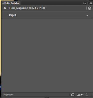
To put together my magazine I used Folio Builder which is part of Adobe Creative Cloud. It is used to combine documents together to create one final product that can be published. To use it you need to sign in to the Adobe Creative Cloud which allows you to access it anywhere on any device. To add the file to Folio Builder, firstly, you have to create a new folio then you can add articles to it. After you have added an article you can update it by saving the files then clicking update of the Folio Builder Menu. For most digital magazines you will need both a portrait and landscape layout that can be added into the articles. 

Folios
Articles
Layouts within an article

Also, it allows you to preview the magazine using Adobe Content Viewer which is another program that can be downloaded onto the Mac or onto and iPad. Having it available on an iPad is really useful as you can see what my final will look like as I designed it to be on an iPad. Content Viewer is good way of testing my product to check that all of the interactive elements work correctly. 


Content Viewer on Mac


Content Viewer

Thursday, 30 April 2015

Screen Recording


Portrait 
https://www.youtube.com/watch?v=cTeBuQNsLxs

Landscape
https://www.youtube.com/watch?v=33qa0bwf_Jc

Production log 27/4

I had to add more pages to my magazine so that I could make an advert and my final article so I added two more page and made the background for both orientations.


Next I made another 'how to' article. I was a simple article with no interactive elements because I decided that it was not needed. 


Finally, I continued to work on my advert, I decided to make an advert for a Dewalt power tool because Dewalt has a strong brand with the bold colours. I changed the advert from my original design because I though that this was a more eye catching design and would get more attention.  I started it on the landscape orientation because I thought that it would be easier to make and would look better. 


Production Log 23/4


I added a contents to my magazine so that the reader can navigate through the magazine. I made it in both orientations. As I make more articles and page I will add to my contents page.


 I added two more articles to my magazine in both orientations. In one of the articles I embedded a youtube video. This means that the reader can also watch a video which means that not all the content is writing. In the screenshot it shows that the youtube video isn't working however I tested it in content viewer on an iPad and it works. To embed a youtube video I had to find the video on youtube then click on 'share' then 'embed', this will give you an embed code that I then pasted into my magazine. I can then change the size and move it about so that it is in the right place in my magazine.


Finally, I started making an advert for my magazine which will include links on where you can buy it and more information. I want to make the advert about a tool that would be useful in a workshop so that it relates to the magazine and would hopefully appeal to the reader.

Production log 30/4

Today I finished my advert, it is a full page advert about a Dewalt drill. I have used a large image of the product with information about it on the side. I used a simple colour scheme, black, yellow and white, which makes the advert stand out and is easily recognisable as Dewalt. I added two links to websites, one link goes to the Dewalt website that has more information about the product. The 'BUY NOW' button goes to a website where you can buy the product. I made this big and bold to persuade the reader to tap the button and hopefully buy the product. Once I finished the landscape design I changed it into the portrait layout. This was easy as I just had to rearrange the objects. The only thing I had to change was that I had to make two columns for the so that it fit.


Thursday, 16 April 2015

Production log 16/4

First I made the logo on every page into a button that when tapped returned you to the home/front page. I did this by selecting the logo then clicking 'Buttons and forms' then turned it into button. Then I set the destination of the button to the first page of my magazine. I added this to every page on both the portrait and landscape orientation and tested it on content viewer to check that it worked.

Next I made my first article, I added two slideshows that both switch between two images. To make the slideshow I added both images that I want to include in the slideshow then using 'Object states' converted the images to one state. Then I could make it into a slide using 'folio overlays', I could change the settings so that the slide show played automatically and adjust how long it showed each image. I also added dummy text to show where the written articles would be. On the third page I used the pan and zoom feature for one the images, this will allow readers to see the image in more detail and look more closely at the image. I made a icon in Illustrator to show that you could move the image however when I put in in my magazine I didn't look very good so I used one that I had found on the internet. Once I had finished this I made it into the landscape version.
My design of the pan and zoom button


Production log 9/4/15


I made the front page and design the layout for the whole magazine. I used the diagonal design throughout which looks good as you scroll down. Also, I made the background layouts for both the portrait and landscape orientation for more pages. I decided to use the orange and beige colour scheme for my magazine and I will keep it the same throughout the magazine. On each page I will have my masthead in the top right corner and the page number in the bottom right corner.