Monday 10 November 2014

Cover Design


I like this design because it is a basic design and doesn't have much information on it. The red colour stands out the most as it fills most the page which makes the design simpler and makes the cover nicer to look at. It has a very straight, rectangular design which the shapes and the font used which makes the magazine have a smart and sophisticated look. 

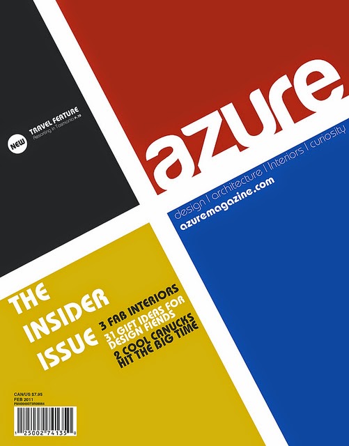
This design is similar to the first as it is basic and uses straight lines. However, everything on the page is an angle. Also the colours are the three primary colour and black which makes it simple and easy to look at.


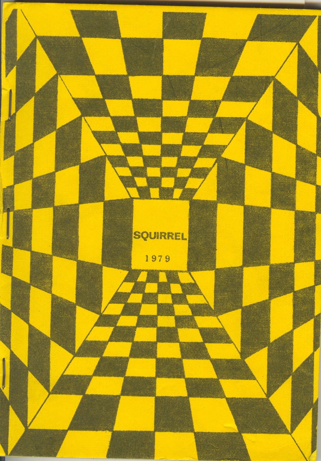
This design is a very different design to what you would usually find on the front of a magazine, it has both simple and complex elements to it. The colour is simple, black and yellow, they both look good next to each other. The shapes used make an illusions which makes it stand out compared to other magazines.


 This design is a simple design that uses one large image as the main part to the cover. I like this design because is uses an image well as it doesn't make the cover to busy and confusing to look at. Also, the colour of the text matches the colour of the cyclist in the image


Thursday 2 October 2014

Layer Effects

Using Layer Effects

This is the original logo I was working on. It had several layers, the 'BRIT SCHOOL' text, the '& ASSOCIATES' text and the building logo.

Original Logo

One the building I added an inner bevel which helps lift the logo of the page by adding a slight gradient around the edge. Also, I have added a red, stroke effect around the edge of the image. This help define the logo from the background. I added a gradient overlay to all of the text. I think this makes the logo look a lot more professional by combining these effects.


Edited Logo

My Logo
This is a logo I made using Photoshop. It is made up of shape and text with layer effects added. This is how to create a simple logo with effects:

1.


To add text click on the text tools which is the 'T' on the toolbar. Also, you can add shape using the shape tool. If you click and hold on it it show other shape you can use however I only used the ellipse tool to create the circles.

2.  To added layer effect you can have to select the layer and either right click and select 'Blending Options' or click of the 'fx' button at the bottom. You can then choose your effects with the blending options. As you can see I have added an inner bevel and a stroke to both the outer circle and the text.


Layers in photoshop


This a two photos that I have added together to create one. I have done this by layering them. I have also added a blur filter to make the people the focal point.

Thursday 25 September 2014

The Rule of Thirds and the Golden Ratio

The Rule of Thirds and the Golden Ratio

Rule of Thirds

The rule of thirds is the breaking down of an image into thirds. The image is split into three parts both horizontally and vertically creating nine areas. The idea is that if the most interesting parts on the virtual lines which creates a balanced image 


Before cropping the image shows us that there is a large group of people having a conversation.


After cropping the image makes the conversation look much more private between the two people in the photo, this is how cropping a photo can change what is happening. I have used the rule of thirds so that Michael Eavis' head is on intersection of two lines. 

The Golden Ratio

The golden ratio is a mathematical ratio that has been considered the most pleasing to the eye. It has been used in architecture, paintings and pictures to make it more attractive to the eye.


Before the photo is not straight and the golden rule has not been applied.


After I have applied the golden spiral when cropping the photo which changes the focal point and the depth of the photo. Also, I have straightened the photo which makes it nicer to look at.


Monday 22 September 2014

Image Resizing and Resampling

Tommy Sarginson


Image Resizing and Resampling

Load an image of your choice, then go to the ‘Image’ menu at the top then click on ‘Image Size’.
Screen Shot 2014-09-18 at 12.23.18.png

Next a window will pop up showing the image size settings. You can change the Width, Height and Resolution, it also shows the image size in megabytes. When you change one of the values they all change to fit to the original size. Therefore, the number of pixels increase when the dimensions of image decrease so that the same number of pixels fit in the same area. This means that in a smaller image there is a higher resolution. This is ok if you are working on the image on a computer because you can work the pixels on a screen however if the image needs to be printed the printer cannot print that higher quality. To change the resolution with changing the dimensions of the image you can select the ‘Resample’ option. This means that the size of image can be changed but it keep the same resolution.


Screen Shot 2014-09-18 at 12.35.59.png

Resolution
Resolution is the number of pixels in a certain area, usually per inch. Each pixel is a colour so many of them create a coloured image. The more pixels in an image increase the resolution creating a higher quality image.


Up and Down Sampling
Up sampling is when the image size is increased there are less pixels so the software add more
pixels to increase the resolution. It works out the colours at each side then creates a similar 
coloured pixel.