 |
| Design 1 |
 |
| Design 1 |
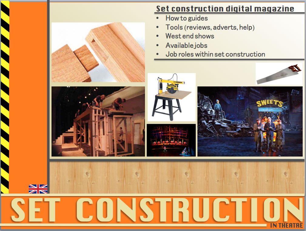
For my first design of the masthead I decided that i want it to be simple. I a font called 'Saucer BB' which looks like it hand been hand drawn but measured as there are lines coming out of it. I used it because I thought it looked like a plan for a piece of set which goes with the theme of magazine. In the second example I changed the font so that is was less complex. This made it easy to read and stood out more.
 |
| Design 2 |
 |
| Design 2 |
My second design was similar to the first, it used the same three colours and still looked simple. I did two versions changing the position of the 'in theatre' text. I used the font 'Kroftsmann' which used sharp angles, this relates to construction because of pieces of set have sharp angles. The boxes I have used can also be used as furniture on other pages of the magazine.
In both designs one and two I only used three colours which helped it look simpler but it also made it look smart and professional. They also make the text stand out by using bold colours.
Other designs
Final Design
For my final design I will use the second design but the second version. I preferred the second version because the 'in theatre' text is in the bottom right because it makes the masthead more versatile compared to the other design. This is because the one with the text in the centre would always have to be in the centre of the page however the has more freedom.


.jpeg)


.jpeg)