Thursday 22 January 2015

Task 1- DPS Workflow

1. Install Adobe Creative Cloud


Buy the relevant Adobe CC package that you want, but for digital publishing you will need Adobe InDesign and having Photoshop will help when working with images. Also you will need to download Adobe Content viewer on any device you intend to publish it on so that you can test your content. Keep this software updated so that all the features work. Make sure you have an Adobe ID and signed in with this on both Indesign and Content Viewer. Finally, if you know you will publish your application on an app store, such as Apple's App Store or Google's Play Store, you will need an developers ID.

2. Open InDesign and Create a new document

For digital publishing you must select 'Digital Publishing' which allows you to select the correct size document so that it fits the device it is being made for. There is an option to use custom page size which means that you can get it to fit any device. Build files in both horizontal and vertical layouts so that the readers is able to rotate their device.


3. Create Folio 


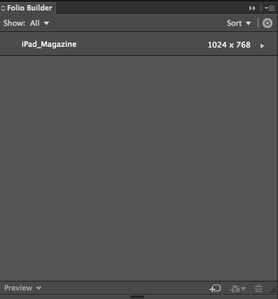
Create a folio in Folio Builder then you can add articles within this folio. You can add the horizontal and vertical versions of a page so that when rotated it is the same page but a different layout.


4. Add Content

Next you can build your content adding text, shape, images and anything you want to include. You can also include interactive element to the work such as embedded videos, social media feeds and features such as slide shows and links. Use the Folio Overlays panel to create and edit interactive objects. To access these tools you must select the digital publishing tools at the top of InDesign. Keep adding articles to the folio as you create the content. Also, update the folio if you are making changes to articles. You can also test your work on Content Viewer while working so that you can get everything to work.

5. Publish Content

Go to the online Digital Publishing Suite and organise your folio using the DPS Folio Producer. It allows you to add titles to the pages and make sure it is in the correct order. Once all the information is correct you can publish your work. Your work can then be publish on app stores for the device it was designed for.


Task 1- Analysing Digital Magazines

Analyse two different digital magazines of your choice (approx 500 words each) – discuss and analyse the use of navigation, animated graphics, overall layout, use of colour and fonts and level and types of interactivity.


International Mountain Bike Magazine 
(http://www.imbikemag.com/) - Issue 33

IMB is a free international online mountain bike magazine that focuses on all aspects of mountain bike. It is published every 2 months and is completely free to read. This free online mountain bike magazine is the most successful online mountain bike magazine of its kind. With readers in over 150 countries round the world it is the only mountain bike magazine to achieve a true global status.


Navigation
The navigation of this magazine is very easy because it is clear and simple controls to turn each page or skip to different sections of the magazine. Also, the contents is interactive so you can click on the part that you want to go to and it will skip to it, this would make it easy to skip through the parts that you have read just like you would in a physical copy of the magazine. There is a bar along the bottom that allows you to slide to page that you want by giving the reader a preview of the page before the page loads.

Animated graphics
There aren't any animated graphics in the magazine which is a negative thing about the magazine. This is because having animated graphics can draw the readers attention towards a specific article or usually an advert. For advertisers this can be very useful as there adverts can reach a wider audience.

Overall layout
The overall layout of the magazine is very good, there are a lot of good quality images with some text. The layout isn't to confusing as the pages are not filled with text, images and adverts. The text is spread out and in small sections which makes it very comfortable to read. Furthermore, the adverts are not on the same page as articles which doesn't distract the reader from the article which also makes it a comfortable experience.

Use of colour 
Most of the colour comes from the pictures because on almost every page there is a large image that fills most the page. The text is in black with a white background which makes it easy to read. The colours that have been used are quite bright colours, for example yellow, orange and green are the main colours used. The front cover used black, red and white which are three bold colours, this fits with the magazine as it is a mountain biking magazine which is extreme sport.

Fonts and level
The same font is used throughout the magazine which gives it a professional look. The text is easy to read as the font is simple and is a good size. The font is a sans serif which makes it look modern and fits with the type of magazine it is.

Types of interactivity
The magazine has used interactive elements mainly in the adverts and some in the articles. The adverts have links to their products which can attract the reader to buying their product as it is so easy. Some adverts also use videos with demonstrations of their products which may attract readers to their product. For example, an Adidas advert on page 3/4 has a link so if you click anywhere on the page it links to the product page on their website. In addition, a video automatically plays which shows the features of their product. This would appeal to readers who prefer visual elements. Some article have buttons link to a video that is relevant to the text. For example, there is an article about tools needed to fix bikes and a link to a video which a demonstration of the tools. This would also appeal to readers who prefer visual content.


Guitar Interactive
(http://www.iguitarmag.com/) - Issue 31

Navigation
The navigation of this magazine is very easy. At the top of the page is buttons to go to the next page or go to a specific page number. It also has an interactive contents, like IMB magazine, which is a good feature as it allows you to go to different articles with ease. It has a search tool so you can search for a specific word and go to the page that has the word on, this would also help you to get to whatever page that you want.

Animated graphics
This magazine has a lot of animated graphics mainly it is adverts that use animations to attract the readers attention. The advert have smooth animations of revealing text an images which makes the reader look at the advert because it draws the reader in. Also, the transitions into the next page are animated to make it look as if you were reading a physical copy of the magazine.

Overall layout
The layout is very good and similar to the mountain bike magazine as the pages are not to full of text. The layout stays the same throughout the magazine with both text and images. This makes it comfortable to read as the layout isn't constantly changing and it also makes the magazine more familiar to the reader.

Use of colour 
The use of colour is the same throughout, they use grey and orange. These colours make the magazine stand out some it is easy to know what you are reading. Like the layout, the colours stay the same throughout the magazine which also gives it a comfortable feel.

Fonts and level
The font stays the same all the way through the magazine whilst being simple and easy to read. Large pieces of text are put into columns which also makes it easy to read. Using the same font in the magazine makes it professional and recognisable.

Types of interactivity
The magazine uses video and links to website on most pages of the magazine. The best use of interactivity is the ability to click on advert which links to the page of the product they are advertising. This can make the reader more likely to buy it because it is so easy to get the product. The videos are a very useful feature as it means that they can have interactive guitar lessons without leaving the magazine. This is an ideal feature for a magazine that is meant to teach the reader how to play guitar.

Task 1- Digital Magazine Publishers

YUDU
(http://www.yudu.com/)

YUDU are an app developer that creates digital magazines for printed content. They can add interactive elements and upload documents and video.They can create both magazines for apps on many devices or for browsers. As well as converting printed magazine into digital content they also build interactive books from scratch, create bespoke HTML5 assets or simply help with your branding needs.  They have teams in London and New York and support partners worldwide. 
They are a modern company that has been made because of the demands of current technology.

Magzter
(www.magzter.com)

Magzter makes magazines available for sale and subscription on mobile devices. Readers can also browse, buy and read magazines on their website. They can make magazines availible on all platforms (iOS, Android, Windows 8) along with your own branded apps with one-single upload. They have the ability to embed multimedia content and add interactive features including video, audio, and embedded links without leaving the magazine/ eBook.

Magzter are a company that has been set up due to the demand for making traditional print magazines into digital magazines. They have also created a 'digital newsstand' were you can view and buy magazine much like you would on a newsstand.

Thursday 15 January 2015

Task 1 - Pros and Cons of Digital and Print Magazines

Pros and Cons of Digital and Print Magazines

Digital Magazines

Pros

For the magazine publishing companies, probably the main benefit of digital magazines is the overall price of producing the magazine is a lot cheaper. This is because there is no need to print the magazine then distribute it. A digital magazine cuts out both of these processes out as once the magazine is made it can be sent to the customer for free on digital media platforms like iPads. This also makes the magazine more eco-friendly. 

Another advantage is that you can add interactive elements to the magazine, this can include videos, music etc. This can appeal to many people because it can have parts where you do not need to read. 


Interactive media in digital magazine can make use be used to advertise more effectively by using video and animations to make the advert get noticed.   


Images can be used better because you can have large images on one page with text on another page. You can also zoom in and move around pictures allowing readers to look at pictures with greater detail.


They can be made for any brand or industry allowing the magazine to be versatile. Also, it can be accessed globally making the product widely accessible. 


Finally, it allows users to keep all previous magazines if they want to read them again. This takes up no space compared to keeping physical copies of the magazine which means your collection is portable.

Easier for the designer to change layout or content and the content is more up to date.

Cons


A negative of digital magazines is that you need a computer, phone or tablet to be able to read it and an internet connection to be able to download it. There are very few people who don't own something to read it on however there are people who don't enjoy read on screens and prefer a physical printed magazine. It can also be harder to read on small screens on mobile devices.


If interactive content is used the magazine may be more confusing because of the extra content, for example advertising banners popping up.


Designer has to think technically when making the magazine as it needs to fit on different devices, such as different mobiles and tablets.

Print Magazines

Pros


An advantage of print magazines  is that you have a physical copy to read that is always available and doesn't need internet to download. This means it can be taken anywhere which people like to do, for example if you are travelling you can't guarantee that there will be internet to download a digital magazine. This makes a physical copy reliable and portable.


Some readers find that they would prefer to read a printed magazine. This means that if the magazine they enjoy turns digital they will probably not read it therefore the magazine may lose readers.


You don't need to wait for the magazine and content to download which could take along time and ruin the readers experience. After you have bought a printed magazine it is instantly available. 


It is easier to ignore adverts in a physical copy of a magazine because if there is an advert you can just turn the page whereas in a digital magazine it might make you watch an advert.


They are less delicate and can be thrown in a bag without the worry of damaging it which you can't do with an iPad or similar devices.


Finally, some people like having a physical copy that they can keep or collect.


Cons


One of the main disadvantages of printed magazines are the cost and time needed for printing and distribution. It can cost a lot to print a glossy magazine and then it needs to be delivered either to the readers home or a shop. This means that the magazine can be limited to a small area as is is to difficult to distribute globally. 


Also, the time taken between printing the magazine and it being available to read is quite a long time meaning that news can change and the magazine would be out of date. 


Can be shared so it can't be tracked by publisher which means that they don't know who is reading it.