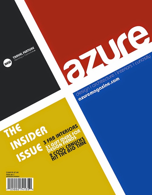
I like this design because it is a basic design and doesn't have much information on it. The red colour stands out the most as it fills most the page which makes the design simpler and makes the cover nicer to look at. It has a very straight, rectangular design which the shapes and the font used which makes the magazine have a smart and sophisticated look.
This design is similar to the first as it is basic and uses straight lines. However, everything on the page is an angle. Also the colours are the three primary colour and black which makes it simple and easy to look at.
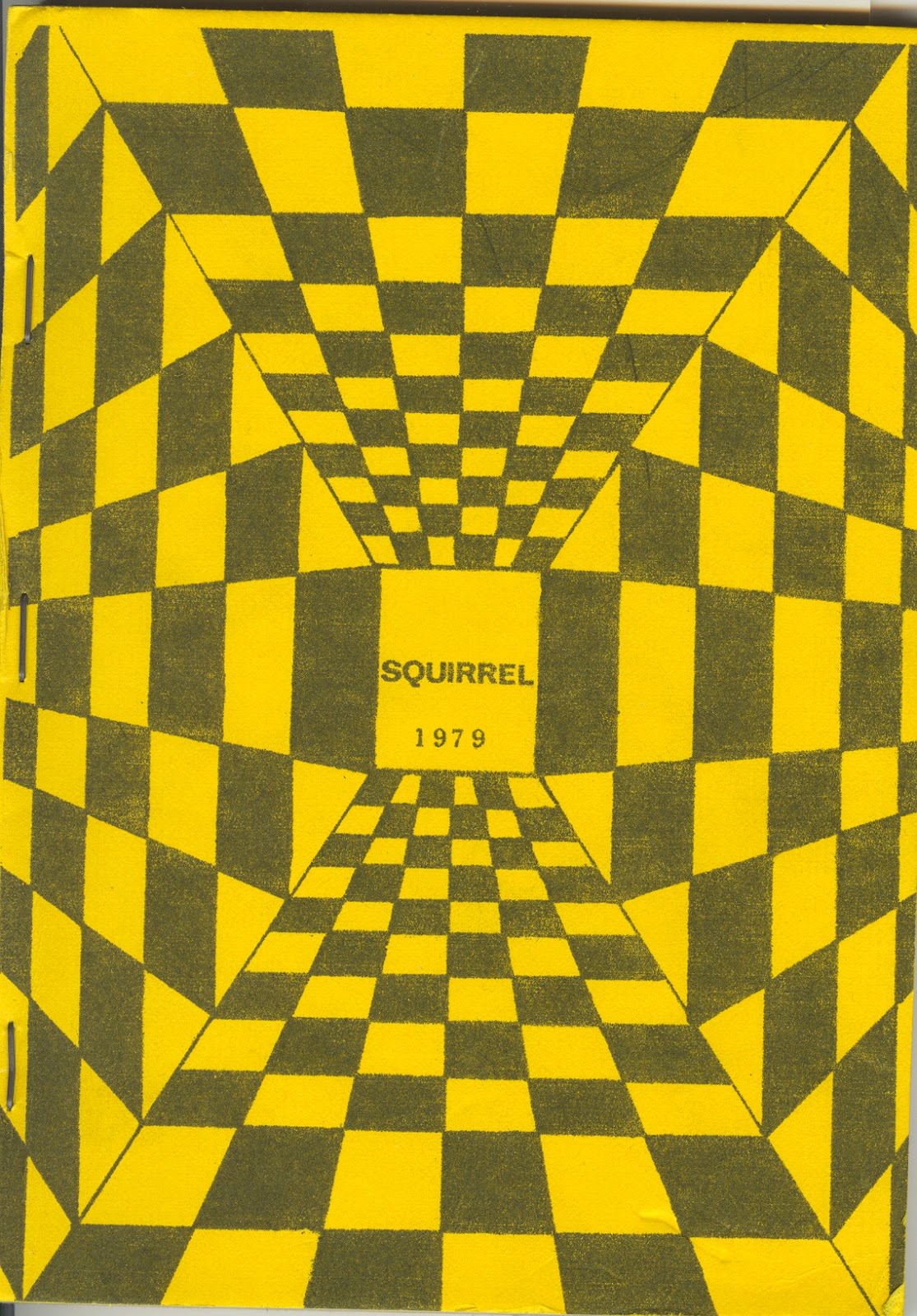
This design is a very different design to what you would usually find on the front of a magazine, it has both simple and complex elements to it. The colour is simple, black and yellow, they both look good next to each other. The shapes used make an illusions which makes it stand out compared to other magazines.


