Thursday 30 April 2015

Screen Recording


Portrait 
https://www.youtube.com/watch?v=cTeBuQNsLxs
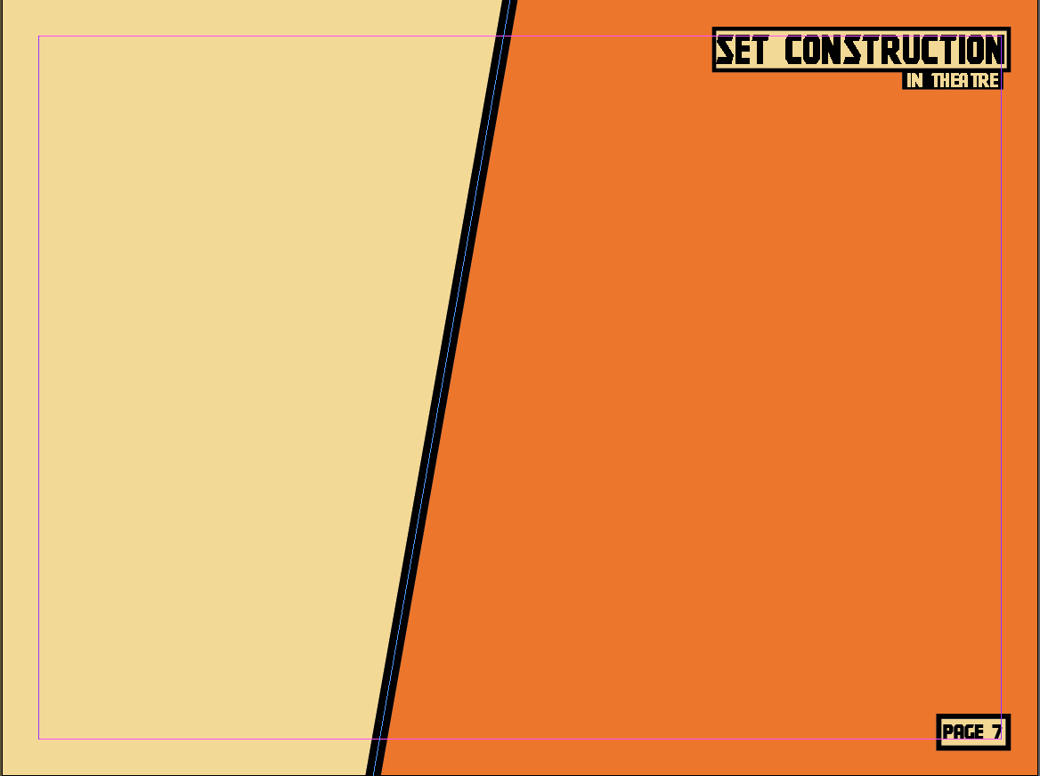
Landscape
https://www.youtube.com/watch?v=33qa0bwf_Jc

Production log 27/4

I had to add more pages to my magazine so that I could make an advert and my final article so I added two more page and made the background for both orientations.


Next I made another 'how to' article. I was a simple article with no interactive elements because I decided that it was not needed. 


Finally, I continued to work on my advert, I decided to make an advert for a Dewalt power tool because Dewalt has a strong brand with the bold colours. I changed the advert from my original design because I though that this was a more eye catching design and would get more attention.  I started it on the landscape orientation because I thought that it would be easier to make and would look better. 


Production Log 23/4


I added a contents to my magazine so that the reader can navigate through the magazine. I made it in both orientations. As I make more articles and page I will add to my contents page.


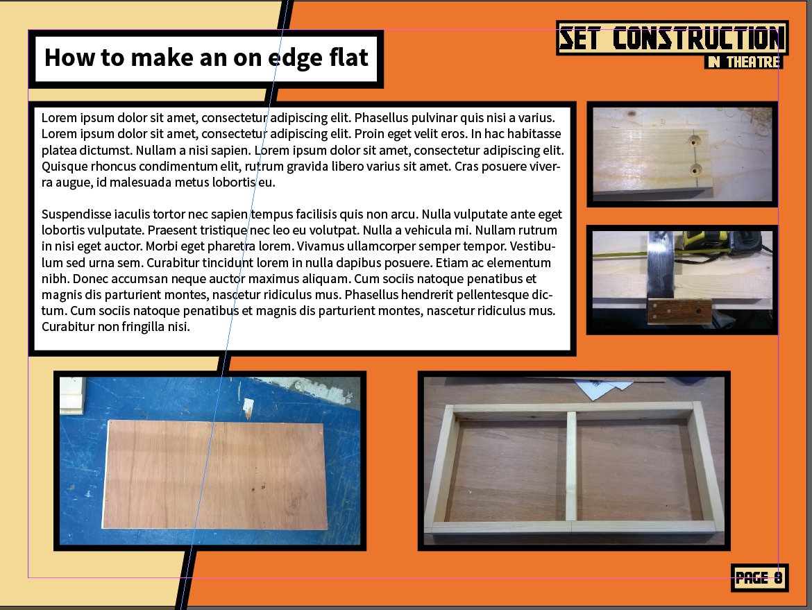
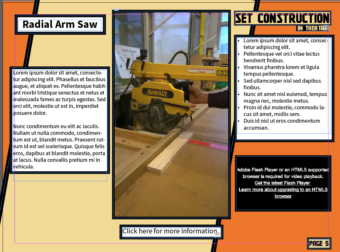
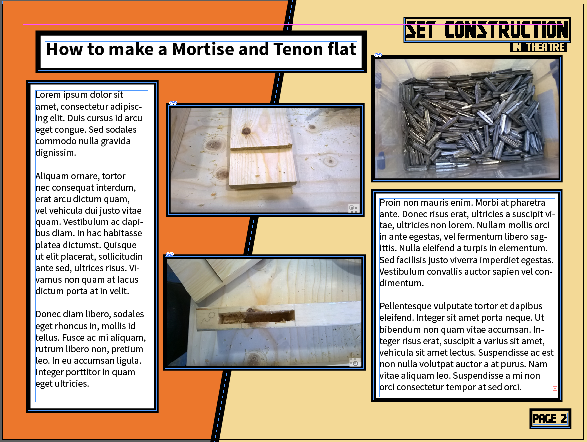
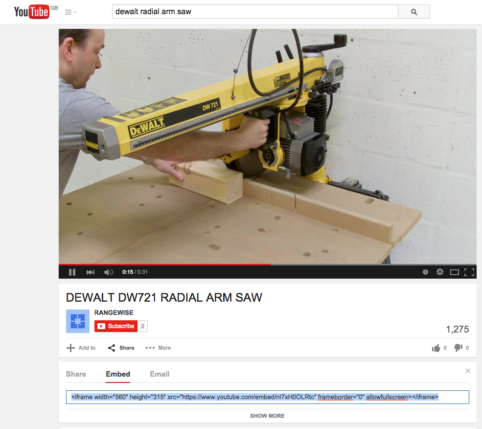
 I added two more articles to my magazine in both orientations. In one of the articles I embedded a youtube video. This means that the reader can also watch a video which means that not all the content is writing. In the screenshot it shows that the youtube video isn't working however I tested it in content viewer on an iPad and it works. To embed a youtube video I had to find the video on youtube then click on 'share' then 'embed', this will give you an embed code that I then pasted into my magazine. I can then change the size and move it about so that it is in the right place in my magazine.


Finally, I started making an advert for my magazine which will include links on where you can buy it and more information. I want to make the advert about a tool that would be useful in a workshop so that it relates to the magazine and would hopefully appeal to the reader.

Production log 30/4

Today I finished my advert, it is a full page advert about a Dewalt drill. I have used a large image of the product with information about it on the side. I used a simple colour scheme, black, yellow and white, which makes the advert stand out and is easily recognisable as Dewalt. I added two links to websites, one link goes to the Dewalt website that has more information about the product. The 'BUY NOW' button goes to a website where you can buy the product. I made this big and bold to persuade the reader to tap the button and hopefully buy the product. Once I finished the landscape design I changed it into the portrait layout. This was easy as I just had to rearrange the objects. The only thing I had to change was that I had to make two columns for the so that it fit.


Thursday 16 April 2015

Production log 16/4

First I made the logo on every page into a button that when tapped returned you to the home/front page. I did this by selecting the logo then clicking 'Buttons and forms' then turned it into button. Then I set the destination of the button to the first page of my magazine. I added this to every page on both the portrait and landscape orientation and tested it on content viewer to check that it worked.

Next I made my first article, I added two slideshows that both switch between two images. To make the slideshow I added both images that I want to include in the slideshow then using 'Object states' converted the images to one state. Then I could make it into a slide using 'folio overlays', I could change the settings so that the slide show played automatically and adjust how long it showed each image. I also added dummy text to show where the written articles would be. On the third page I used the pan and zoom feature for one the images, this will allow readers to see the image in more detail and look more closely at the image. I made a icon in Illustrator to show that you could move the image however when I put in in my magazine I didn't look very good so I used one that I had found on the internet. Once I had finished this I made it into the landscape version.
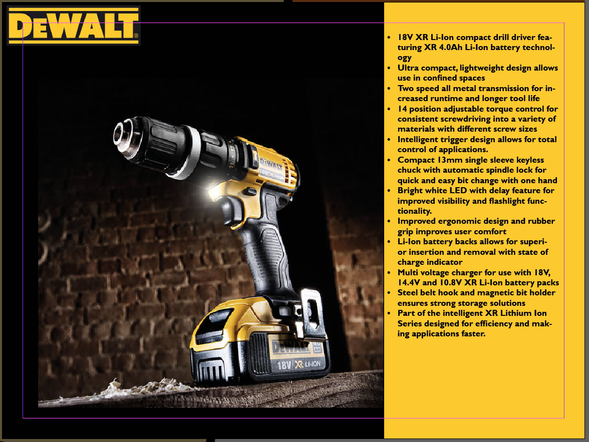
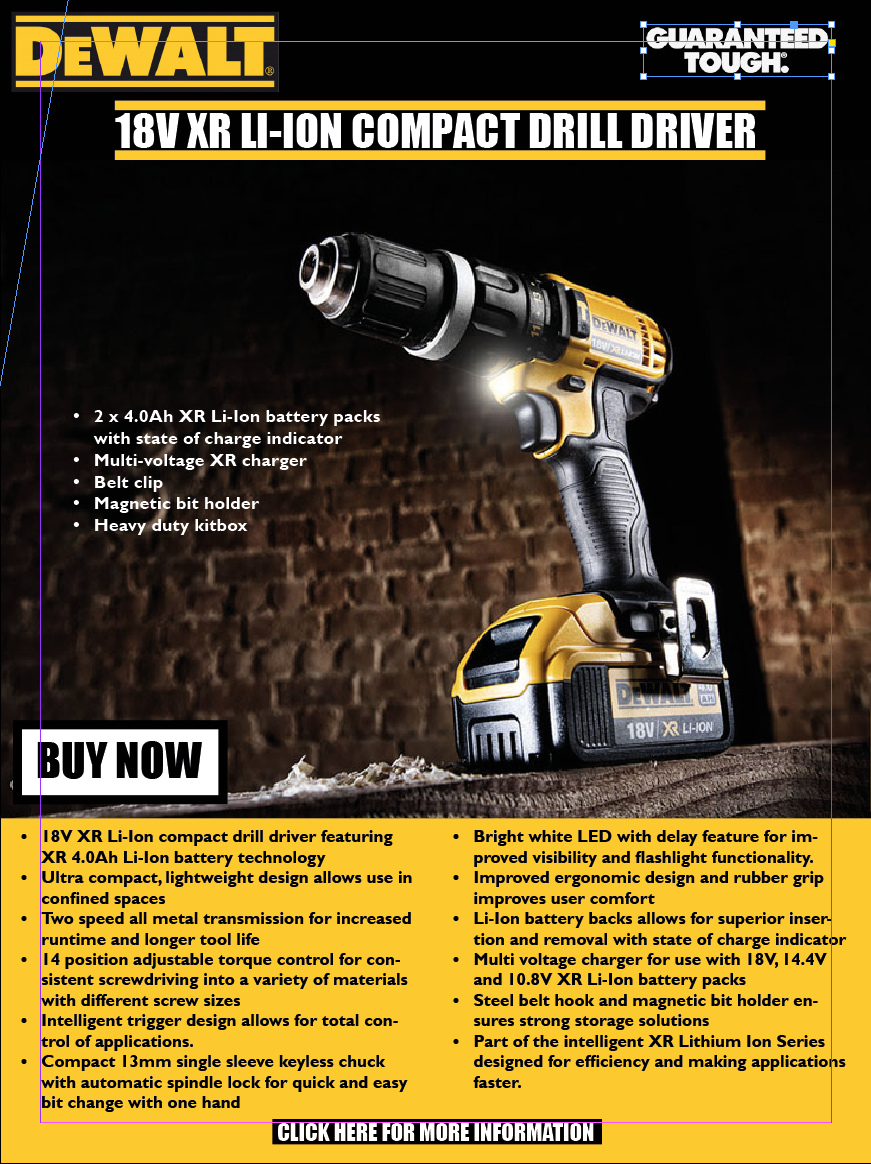
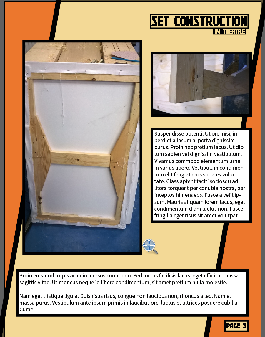
My design of the pan and zoom button


Production log 9/4/15


I made the front page and design the layout for the whole magazine. I used the diagonal design throughout which looks good as you scroll down. Also, I made the background layouts for both the portrait and landscape orientation for more pages. I decided to use the orange and beige colour scheme for my magazine and I will keep it the same throughout the magazine. On each page I will have my masthead in the top right corner and the page number in the bottom right corner.